We all have an interest in typography even if we don’t know it. Try saying “I love you” in Bodoni Small Caps. Our handwriting, a version of typography, is as much part of our character as a chosen hairstyle… just not as prominently displayed.
I came across some small paintings this week that were made over the pages of a book. They are by an Italian artist called Giorgio Dapino. I thought them rather beautiful. The paint on paper is tender in its own way but the paragraphs in the background are a layer of gritty texture that offsets the softness of the watercolours.

Giorgio Dapino

Giorgio Dapino

Giorgio Dapino

Giorgio Dapino
This led me to thinking about how artists use type in their work and how it ranges from absolutely integral messaging to subliminal background texture, such as the images above. It would be interesting to know if, in this case, the German texts were chosen because they have a particular relevance to the image of if they are just from an old book that happened to be suitable.
At the other end of the spectrum, when it comes to using text in art, we might find someone like Colin McCahon, New Zealand’s acclaimed modern artist, best known for his large paintings with dark backgrounds overlaid with religious writing. Without the texts the paintings would be empty. They are fundamental to the aesthetic and the meaning of the piece.

Colin McCahon's Gate 3 being installed at Auckland Art Gallery. 1971
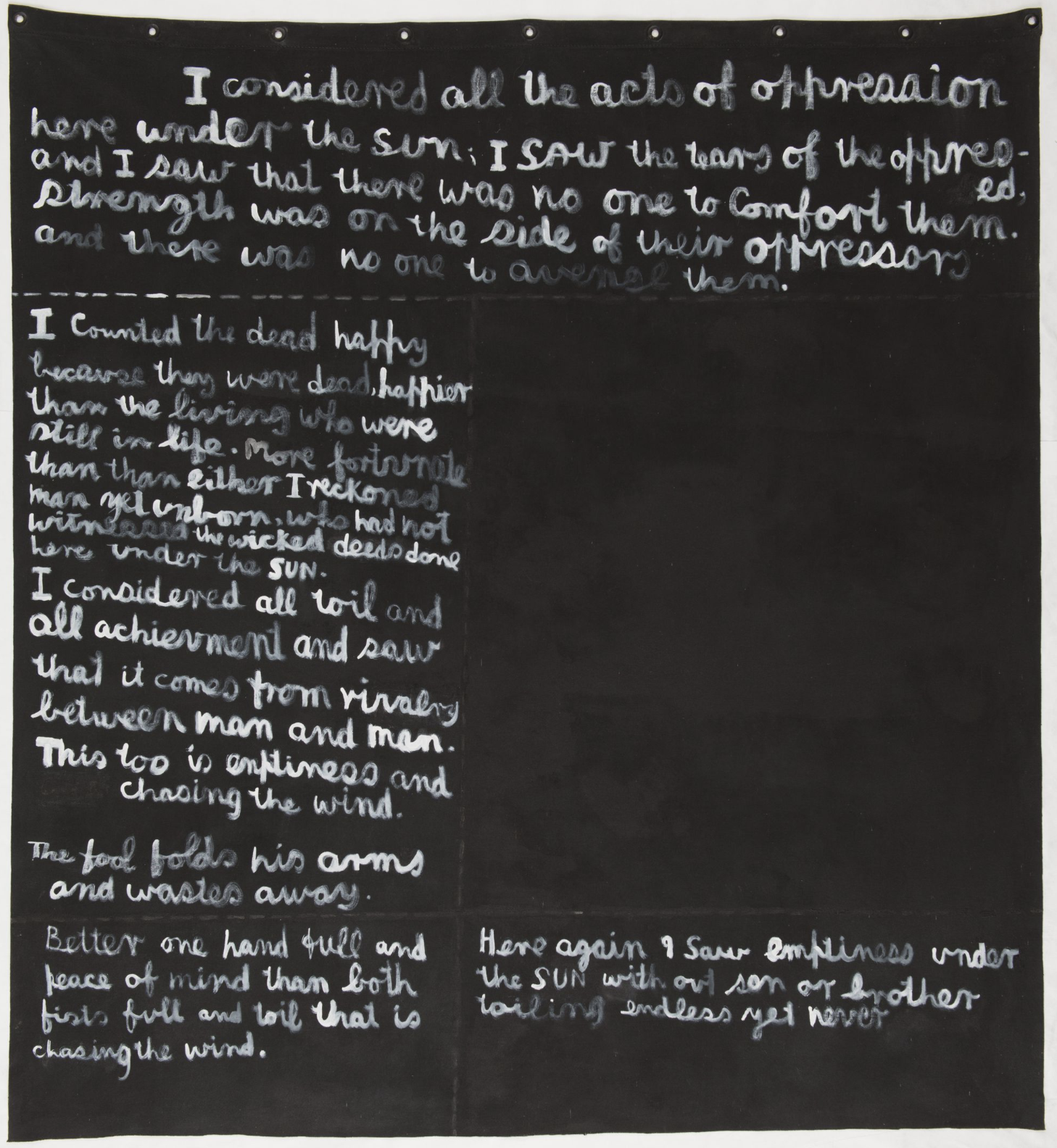
Colin McCahon
In two of my early exhibitions I showed photographic images layered with typography that I had captured in the same environment. I remember feeling slightly uncomfortable about what I was doing.
It worried me, that by overlaying type, embellishing the central photograph, I was in a way admitting that it wasn’t strong enough to stand on its own. Compounding these doubts is my long held belief in the need for a level of objectivity in documentary photography, and what could be more subjective than manipulating an image with words.
I think the danger of using text with imagery is that you spoon feed your viewer. Clumsily telling people what to think is never a good way to behave! Balancing the relationship both visually and intellectually between the type and the image is the key to making this work.
And it’s hard to tell if you got it right!

“Stumble in Life” 2009 110cm x 110cm

“Ahab, David, Solomon” 2017 140cm x 110cm

“Hotel Sentiment” 2014 110cm x 140cm

“What is Your Talent” 2017 140cm x 110cm
To receive notifications of new posts email mark@markchew.com.au